So, picture this:
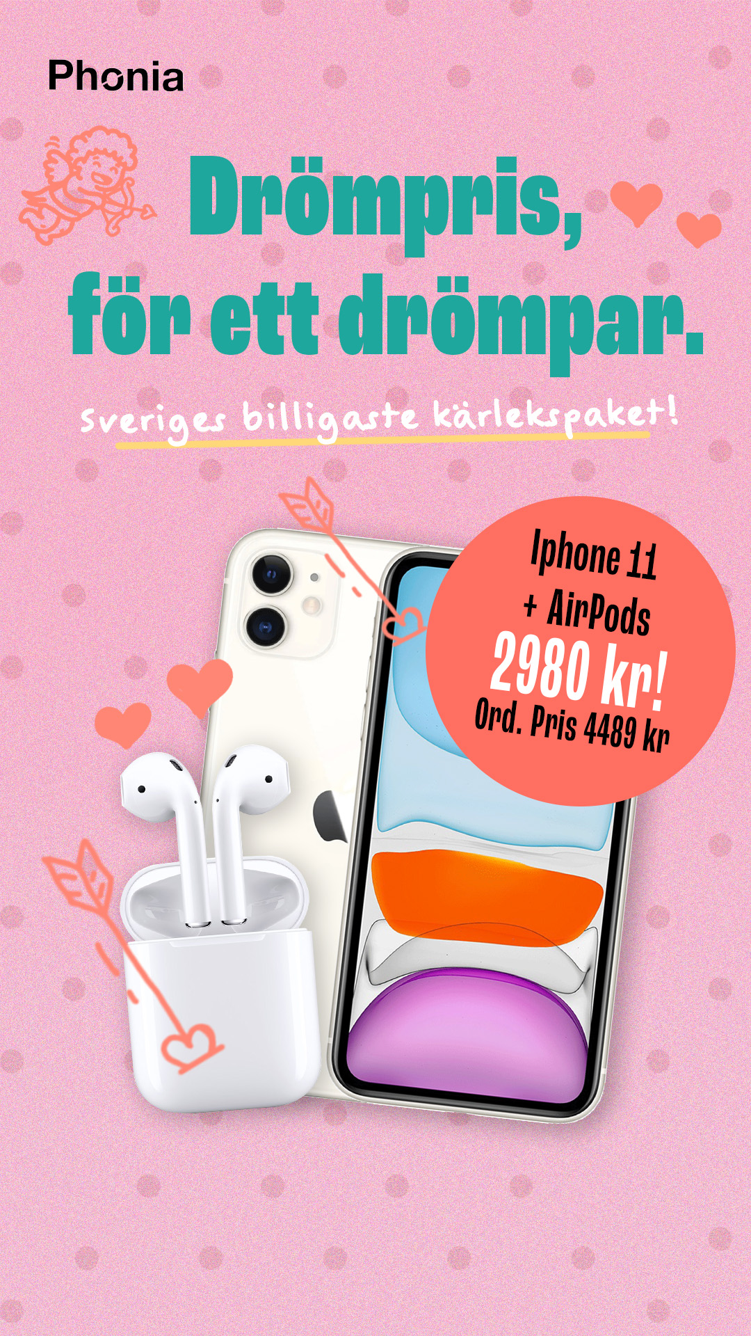
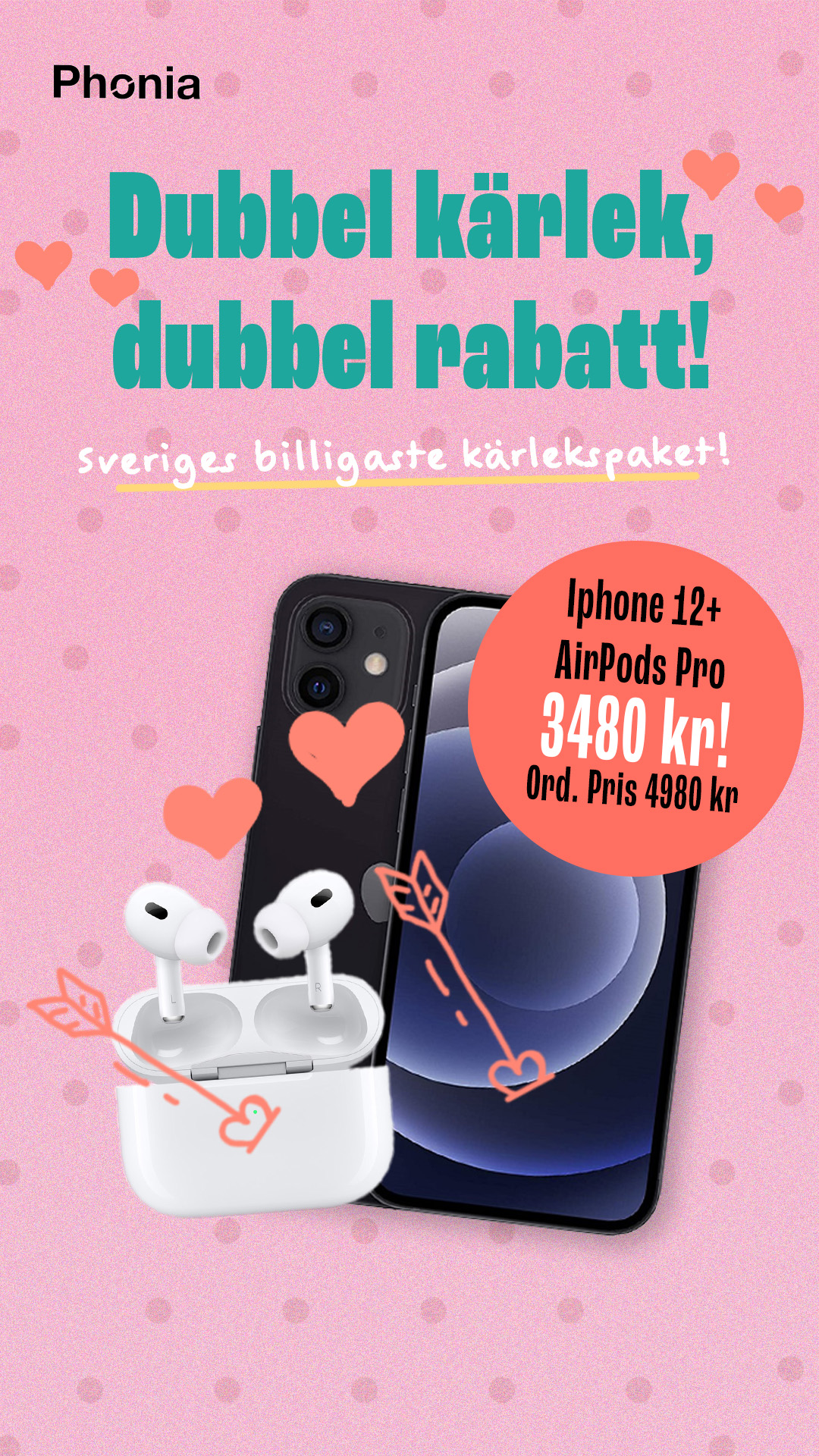
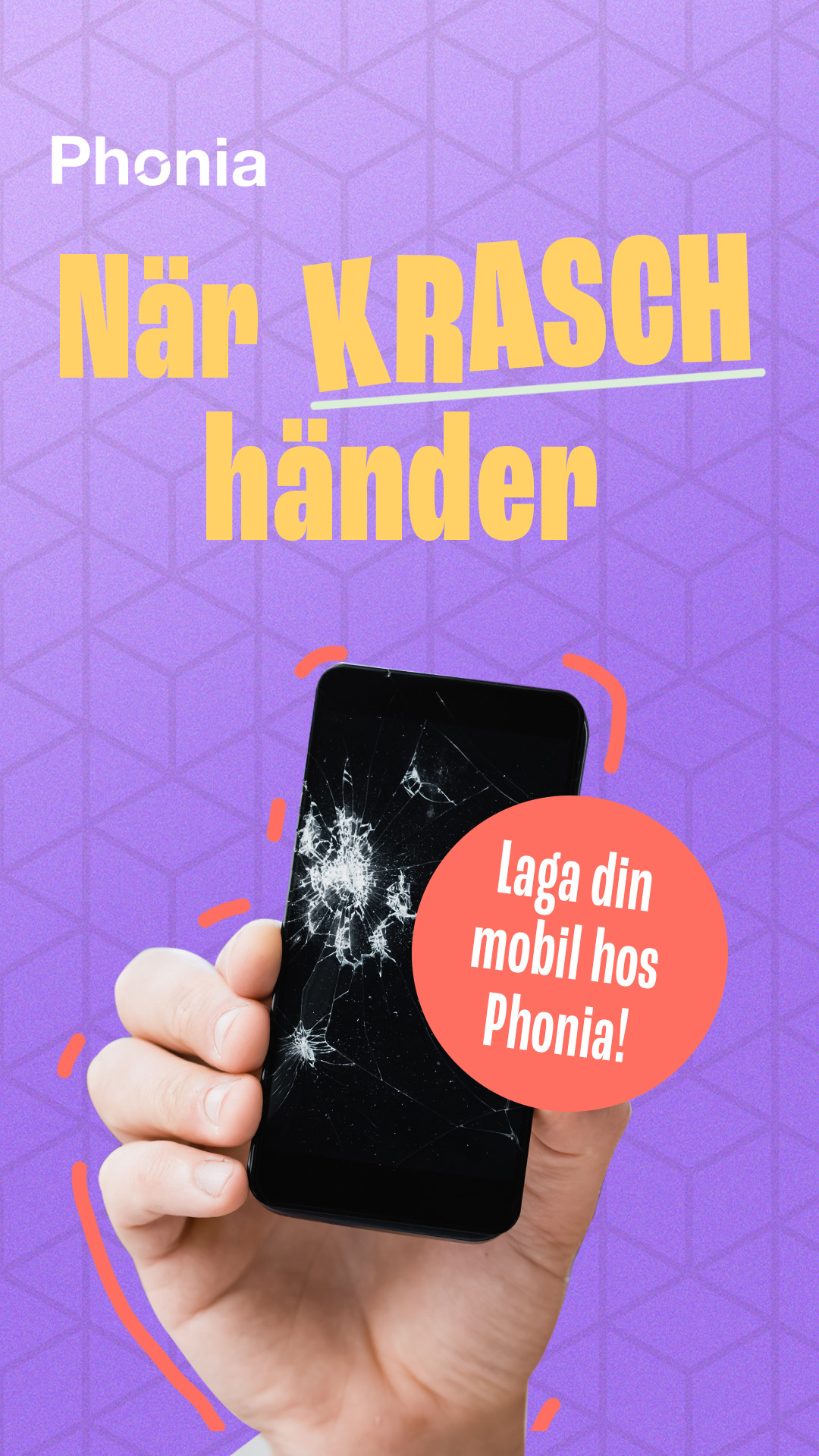
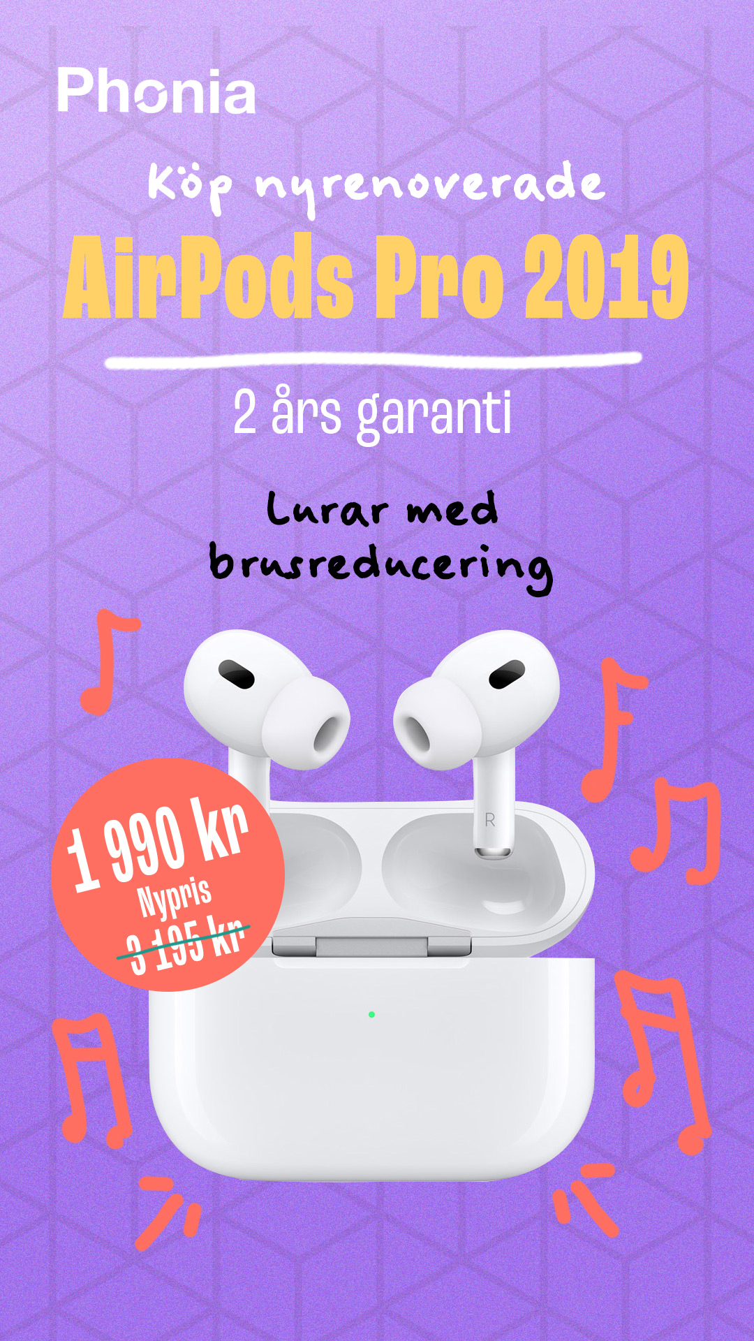
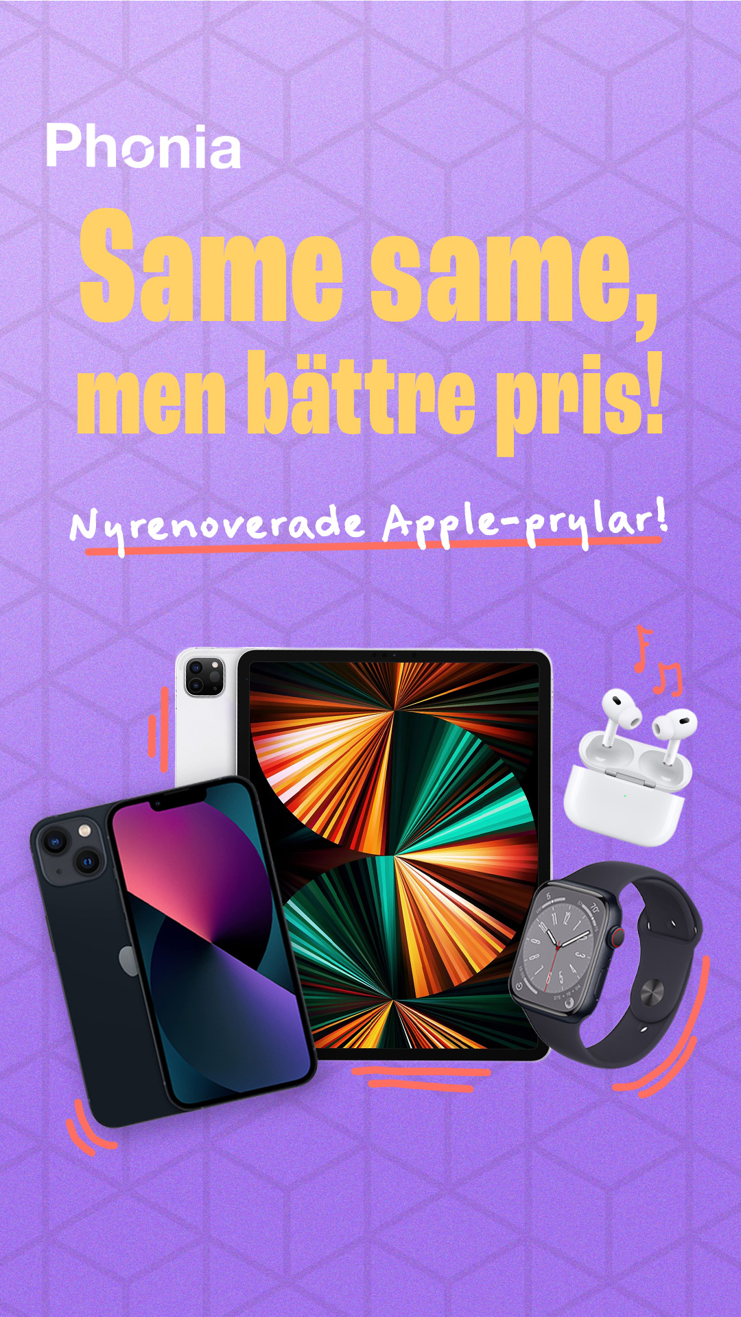
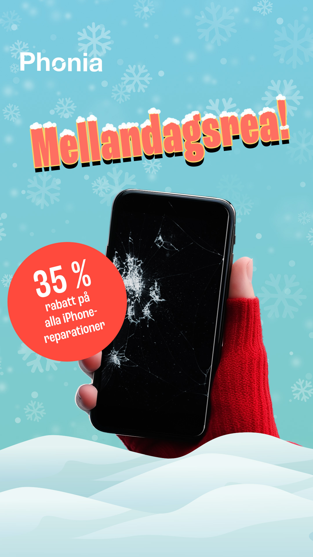
I get asked to create a brand identity for Phonia — a bold new player in the refurbished mobile scene.
So, picture this: I get asked to create a brand identity for Phonia — a bold new player in the refurbished mobile scene. You know, the folks giving old phones a second life and saving the planet one recycled screen at a time. No pressure, right?
The mission? Craft a look that screams modern, trustworthy, and eco-chic — all without putting people to sleep. The idea was to make Phonia stand out in a sea of “meh” tech brands and connect with the cool crowd who actually care about sustainability and aesthetics.
I went for a design vibe that’s clean, confident, and a little futuristic — like your phone just came back from a spa day. Every detail, from the colors to the materials, shouts “we love the planet, but we’ve got style.” Recycled elements? Check. Minimalist layout? Double check. Vibes? Immaculate.
While most refurbished brands are out here playing it safe (hi, generic logos and stock icons 👋), Phonia wanted more than a facelift — it wanted a personality. Where others talk about warranties and certifications, we leaned into design as a statement. Because when you look good and do good, that’s a winning combo.
In the end, Phonia’s brand identity turned into a love letter to smart design and sustainability. It’s proof that thoughtful creativity doesn’t just make you stand out — it makes people actually remember you.
Now if only my own phone battery could last as long as Phonia’s refurbished ones…
Peace, pixels, and recycled circuits.
